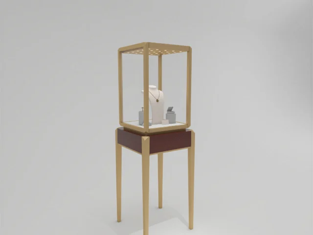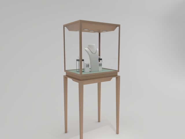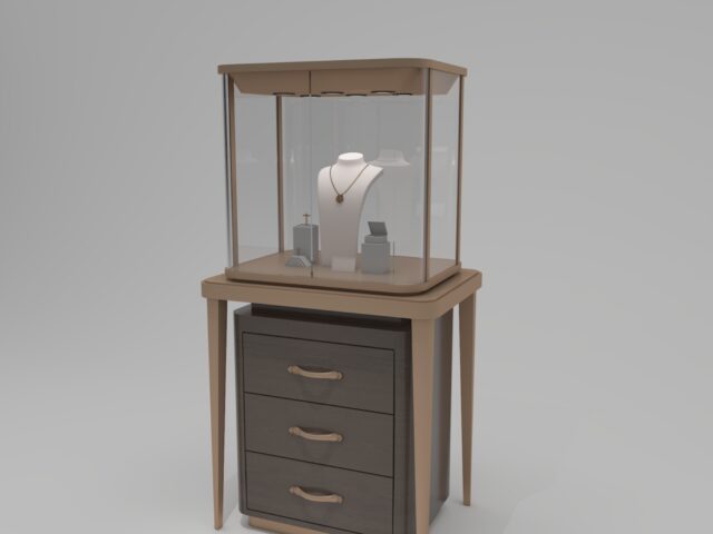
Labels are the quiet workhorses of any museum display. Done well, they let a visitor read about a Ming vase or a 19th-century pocket watch without ever leaning into the glass or stepping in front of other people. Done badly, they create glare, block the object, or force guests to crouch. This article sets out concrete, measurable rules for label placement in museum display cases, from the reading height of a standing visitor to the number of lux on a label surface. The goal is simple: maximum readability, zero obscuration.
Set the reading band from real visitor eye heights
Label placement starts with the person, not the object. The eye height of a standing adult ranges roughly from 1,500 mm to 1,650 mm, while a seated visitor or a child in a wheelchair may be at 1,100 mm to 1,200 mm. A practical rule used in exhibition design is to place the center of a primary label between 40° and 50° below the average viewing height, which for a standing adult puts the label center around 1,050 mm to 1,150 mm above finished floor. This low-tilt range allows comfortable reading without neck flexion of more than about 20°.
If you operate a case with a plinth 900 mm tall, that means the label sits near or slightly below the standing viewer’s waist, a comfortable zone for a 150–200 mm viewing distance. Where labels must be placed inside a wall case, aim for a label center no more than 1,400 mm and no lower than 950 mm from the floor. Below 950 mm, older visitors and children read less reliably; above 1,500 mm, shorter visitors tip their heads upward and lose focus.
Distance, size and angle: the 1:200 readability rule
The most reliable starting point for label text is a cap height of at least 1 mm for every 200 mm of viewing distance. In practice, a label read from 500 mm should use a minimum text height of about 2.5 mm (approximately 9 pt at typical print resolution). Body text below 8 pt is almost always a mistake in museum contexts, because lens-age effect and glare reduce effective contrast. Keep line length to 40–60 characters, line spacing at 120–140% of text size, and align text left; centered paragraphs slow reading by 5–10%.
Tilt the label toward the viewer at 15° to 30° from the horizontal. A 20° tilt on a label 1,100 mm high typically eliminates the worst of the reflection from overhead lamps and allows a visitor to read while standing upright. For vitrines with a flat glass top, an angled label plinth set just inside the case is worth the extra fabrication cost.
Position labels so they never cover the object
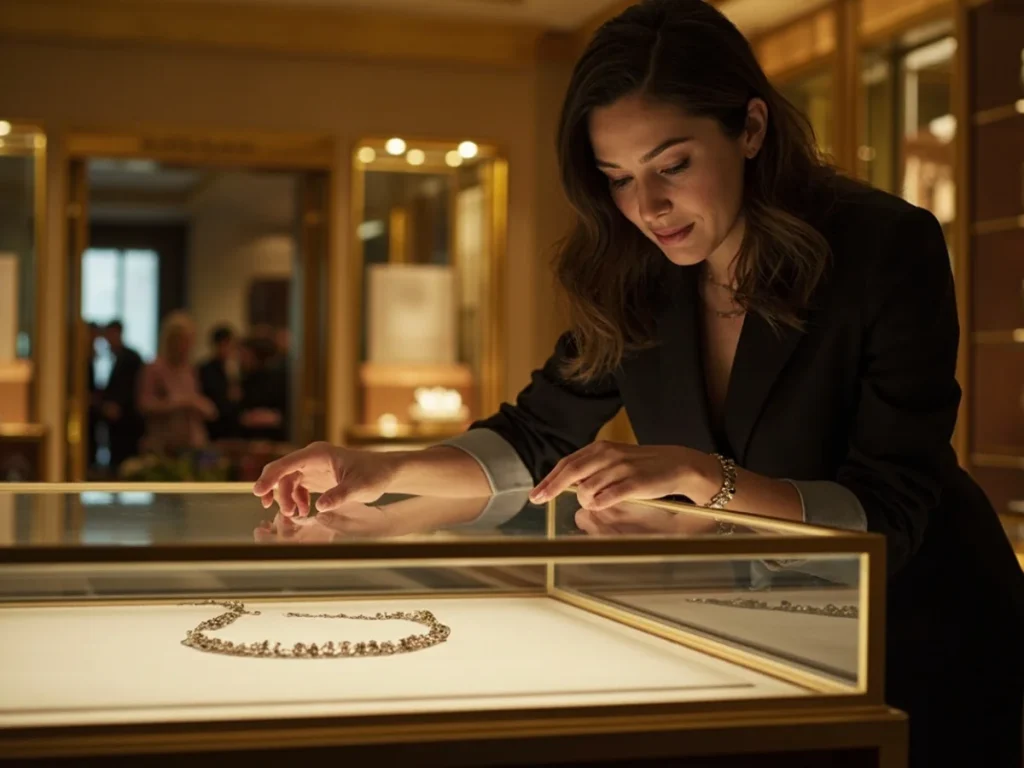
A label should live in the visitor’s field of view but outside the primary object window. In a table case, reserve a label zone at the front edge of the case interior, at least 80 mm from the glass and no more than 150 mm from it. In upright wall cases, place labels beside the object at the same level as the object’s lower third, never directly above the object where shadow lines fall. If a case is compact (under 400 mm of interior depth), use an angled plinth or a side-mounted crescent.
For densely grouped objects, one primary label can serve a cluster if it is placed within 200 mm of the leftmost object and aligned with a clear sightline. Secondary “tombstone” labels can then sit closer to individual pieces; 15–20 mm of separation keeps them legible without visual clutter. One helpful checklist:
- Measure the label center height against the primary viewer eye height (1,050–1,150 mm standing).
- Set the viewing distance (glass-to-eye) and scale cap height at 1 mm per 200 mm.
- Tilt the label 15°–30° and check for lamp reflections from two visitor positions.
- Keep the label zone inside the case at the front or side, never over the object.
- Confirm a minimum 8 pt body text, 40–60 characters per line, left-aligned.
Balance label lighting against object lighting
Objects should not be cooked by lamps, and labels should not be under-lit. Aim for 150–200 lux on the label surface, or roughly one-third to one-half the illumination on most delicate artifacts. For a matte label stock with a reflectance of around 80%, this yields a contrast ratio of 7:1 or better between black text and the surface, which remains readable under aging eyes. Where LED spots are used, a 24°–30° beam angle placed no closer than 300 mm avoids hotspots.
Controls block light damage but also cast shadows. Where a glass case uses anti-reflective glass at under 1% reflection, label readability improves enough that you can cut label lighting by 20–30%, saving heat load in the case. Libafang often specifies angled label plinths and anti-reflective glazing as a matched package for museum projects, because the two factors determine readability more than any single material choice.
Material and typography choices that finish the job
Choose label stock that is matte, neutral and non-yellowing; a 3 mm matte acrylic or 2 mm aluminium composite panel prevents glare and resists warping in a museum climate of 45–55% RH. Avoid gloss laminates, which create mirror glints under directional light. In terms of type, a humanist sans-serif at 10–12 pt with generous spacing reads better at low light than a condensed serif. Bilingual labels should stack the primary language first, with a secondary language at 80–85% of the primary text height.
Finally, check each label from three positions: standing adult, seated adult, and a child at 1,100 mm eye height. If the label is legible from all three without a visitor having to move, the placement is working. Where the three positions conflict, favor the lower viewpoint; it is easier to step back than to crouch forward. A manufacturer that understands these sightline variables can custom-cut label holders, angled plinths and reading boards to match the exact geometry of your case, rather than forcing a standard fixture into an exhibition where it will never quite sit right.
Need a placement plan for a current or upcoming exhibition? Libafang’s design team can produce a free 2D case layout with a marked label zone and proposed holder angles, and a no-obligation quote for the finished components. Send us your case dimensions, artifact heights and intended viewing distances to get started.