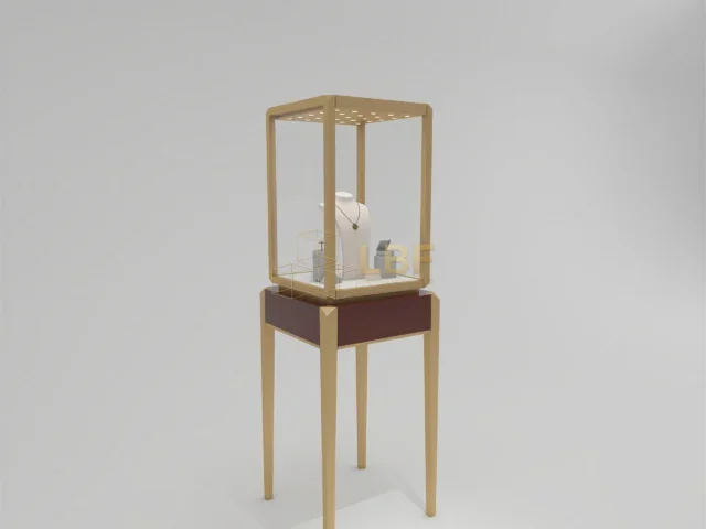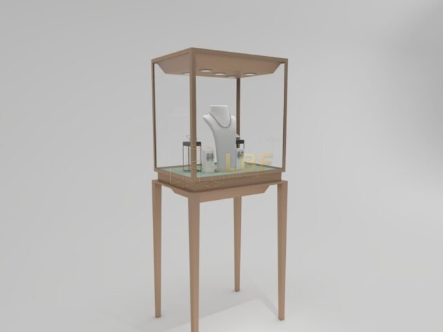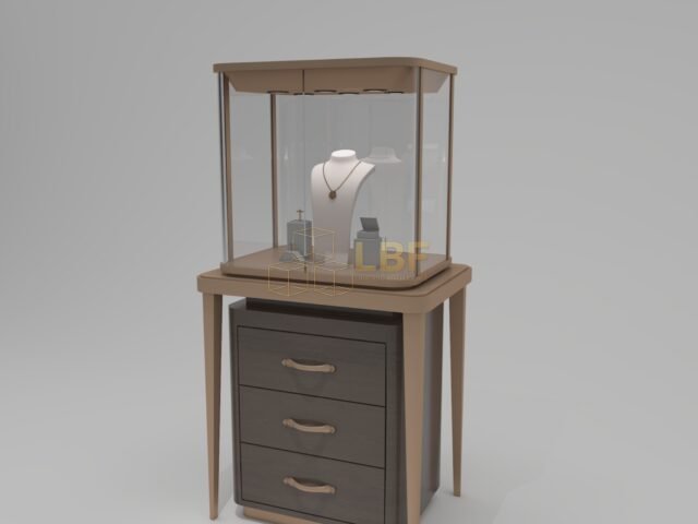
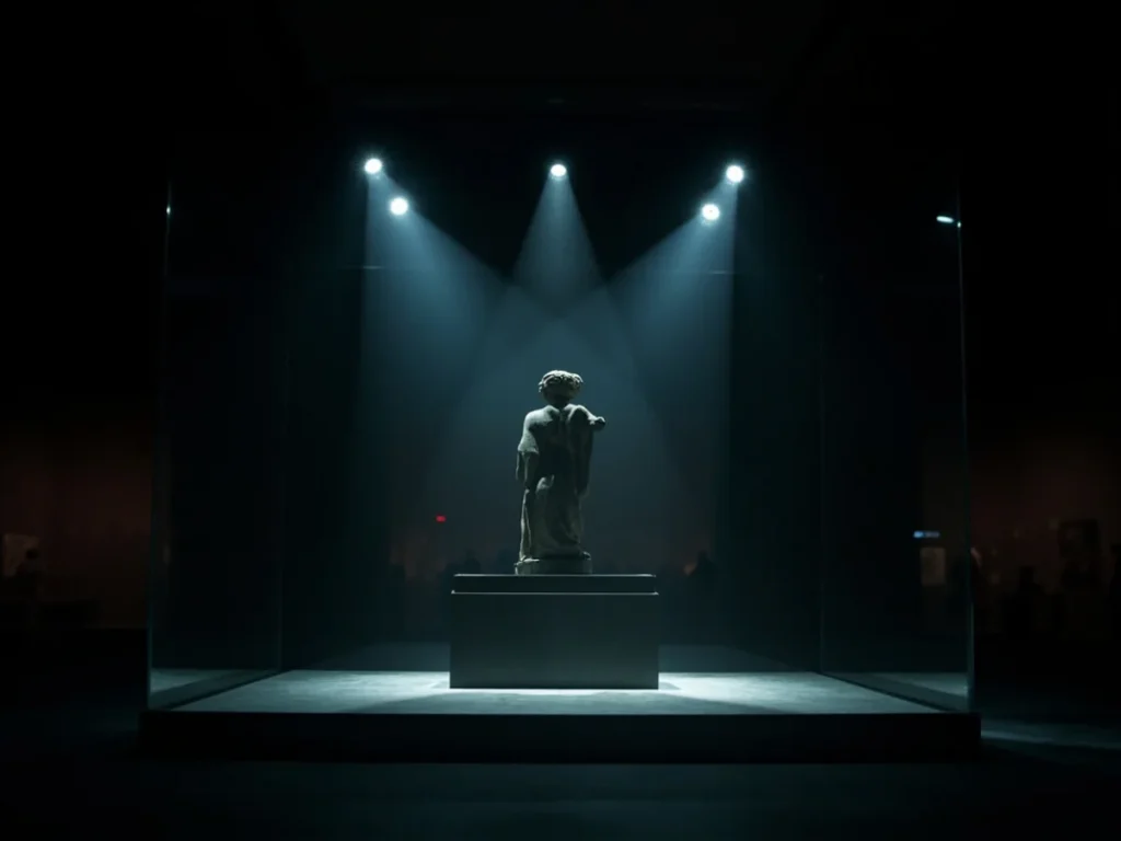
Most museum display case discussions start with security and end with lighting. Sightlines usually come last — and that is where accessibility quietly fails. A case can be beautifully made, perfectly lit, and still unusable for a visitor in a wheelchair, a child, or a 195 cm basketball fan who has to crouch to read a label. Getting accessible museum display cases right is a planning problem, not a product catalogue problem. It begins with the people in front of the glass and works backwards to dimensions, angles, glass, and light.
Start With Viewer Profiles, Not Average Visitors
Design teams often anchor everything on a single “average visitor” roughly 165–175 cm tall. In practice you are designing for a spread: seated eye height for an adult in a wheelchair is typically around 110–125 cm; a standing adult’s eye height sits near 150–165 cm; a 7-year-old child may be at 100–115 cm. If your key object sits above 140 cm, the seated visitor is looking at the underside of the deck. If it sits below 90 cm, the older standing visitor has to bend uncomfortably.
The practical solution is layered sightlines rather than one compromise height. Design the primary viewing band — the zone where the focus object sits — between roughly 95 cm and 135 cm above finished floor for general collections. Reserve 135–160 cm for larger works that read at distance, and keep any object you want children to engage with below 110 cm. When a case must hold a high-mounted object, provide a nearby low viewing element such as an angled mirror panel or a digital supplement, but do not treat those as substitutes for a well-planned case.
Work Out the Viewing Geometry Before You Buy a Case
Sightlines are determined by three numbers: eye height, viewing distance, and the angle at which the eye meets the object. For a standing display, most visitors stand 45–60 cm from the glass. For seated visitors, that distance grows to 65–85 cm because the chair and footrests hold them back — which is exactly why cases designed tight to the glass end up with poor accessible viewing.
Here is the practical sequence we recommend to museum teams specifying accessible museum display cases:
- Fix the viewing band for each case (for example 100–130 cm) based on the object and the visitors who matter most.
- Measure the setback from glass to object so the top of the object stays within a 30° downward angle from the nearest expected eye height.
- Choose glass and frame accordingly — a rebated deck and frameless front panel increase usable view for seated visitors by limiting obstruction at the bottom edge.
- Allow knee clearance of at least 70 cm high, 75 cm wide and 45 cm deep in front of at least one viewing position on fixed cases where practical.
- Mock up in cardboard at 1:1 on site with real chairs before fabrication. This 20-minute exercise catches most sightline failures.
Glass, Frame and Lighting Choices That Affect Accessibility
Low-iron, anti-reflective laminated glass is the baseline for serious museum work, typically 8–10 mm with a laminated interlayer for UV and security. Anti-reflective coatings can push light transmission to over 98 percent and cut reflectance to under 1 percent, which matters far more than aesthetics: glare is a visual barrier for visitors with low vision and anyone using a screen or magnifier. Frame profiles should be minimal and, where possible, sit below the object line so they do not cut into the viewing band for shorter visitors.
Lighting needs the same care. Keep object-facing illuminance at 50 lux for sensitive works on paper, around 150–200 lux for textiles, and up to 300 lux for robust metal and stone, measured at the object surface. Place LED strips at the top front or in a recessed light ceiling with a 30–45° beam toward the object, never pointing into visitor eyes. Consider motion-triggered illumination with a short fade-in: it reduces glare from empty cases and cuts energy use, while keeping light on the object only when someone is actually looking.
Labels, Seating and Circulation Complete the Experience
Sightlines do not stop at the glass. Label text placed higher than 140 cm or lower than 85 cm is effectively invisible to a large share of visitors. Use 18–24 point text at approximately 400–500 mm viewing distance, mount raked panels to reduce reflections, and position the top of each label within the primary viewing band. Large-print duplicates and tactile elements help visitors with low vision and are inexpensive to add at the design stage.
Circulation deserves numbers too. A clear route of at least 900 mm width allows most wheelchairs to pass; 1200 mm is better where visitors may stop and read. Leave 900–1200 mm between a case and the wall behind it and keep any loose seating out of the primary viewing lane. A small number of higher stools near tall cases can transform the visit for children and older visitors without harming the gallery’s appearance.
Build In Flexibility and Review It With Real People
Collections rotate, so a case specified for one object should survive a change of contents. Modular shelf systems with adjustable brackets in 25–50 mm increments, movable decks, and light adjustments within a 30 percent range let curators rehang a case without rebuilding it. During commissioning, run a quick sightline check with volunteers of varied heights and at least one wheelchair user; document the outcome on a simple plan and keep it with the case drawings.
Libafang Showcase Co., Ltd. manufactures custom display cases for museums, jewelry stores and watch boutiques, and exports to over 30 countries. If you are planning an accessible gallery and want a partner who will work through sightlines, dimensions and lighting with your team, send us your brief and we will come back with a free design and quote tailored to your space and collections.