Colored gemstones are the hardest products to display well. A ruby can look brown under the wrong backing, an emerald can lose depth behind a pale panel, and a tanzanite display can drift from violet to grey depending on the LED temperature. Unlike diamonds, colored stones do not have a neutral fallback — their value is created by the relationship between the stone, its immediate background, the case interior, and the lighting. Gemstone display cases are therefore less about the furniture and more about controlled color environment. This guide covers practical approaches used in jewelry and museum projects: what backing materials to specify, which color combinations work, how to group diverse stones without visual chaos, and the light targets worth writing into a purchase order.
Start With the Stone, Not the Case
Before selecting a backing tone, measure or obtain the stone’s color attributes from the supplier: dominant hue, saturation, and tone. The rule used across most professional setups is backing tone should sit at least one full step away from the stone’s tone — darker stones need mid-to-light backings, and light or pastel stones need mid-to-dark backings. A light-toned aquamarine or morganite placed on a white or cream panel loses definition and reads as washed out; a deep blue sapphire on jet black becomes a flat shape with little internal fire. Matching the backing to the stone’s hue too closely (pink tourmaline on pink felt, for instance) is equally risky — it removes contrast and the stone appears to bleed into the surface.
Backing Materials and Colour Targets by Stone Family
Delivered colour can shift by 5 to 15 delta-E between a digital swatch and a physical sample, so physical samples under the store’s actual lighting remain the only reliable method for approval. Below are workable starting combinations that crews can prototype quickly. Choose one column per display order and keep it consistent across a collection.
- Reds and pinks (ruby, pink sapphire, rubellite): warm mid-grey or greige suede; avoid pure white, which blows out saturation.
- Blues and purples (sapphire, tanzanite, iolite): cool light grey, ivory, or pale champagne; avoid black and navy.
- Greens (emerald, tsavorite, peridot): soft warm white or light taupe; avoid saturated green.
- Yellows and oranges (yellow sapphire, citrine, spessartine): mid-brown, warm slate, or burgundy; avoid yellow and gold.
- Light/pastel stones (aquamarine, morganite, moonstone): charcoal, deep navy, or chocolate to create separation.
- Colorless and near-colorless (diamond, white sapphire, rock crystal): mid-grey or cool white; jet black hides the rim and roughs up the facet edges.
Material matters as much as hue. Suede (roughly 0.6–0.9 mm) and nubuck hide fingerprint marks and small scratches but trap dust; microfiber is easier to clean but flattens stone facets; satin and velvet have strong nap directionality and must be cut on the bias so the light hits evenly across a whole tier. For high-value museum pieces, consider a matte coated board or none-reflective fabric at 3–6 gloss units to keep specular reflections under control.
Lighting Numbers That Preserve Colour
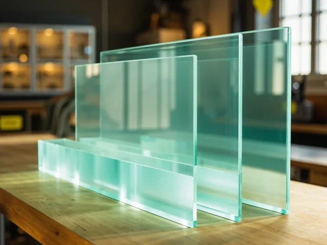
Most gemstone colour complaints are lighting errors. Specify these targets on the order: 4000K–4500K neutral white, CRI of 92 or higher, R9 above 50 (for reds), and vertical illuminance of 600–1,000 lux at the plinth. Avoid low-CRI 3000K strips — they push reds toward orange and make pink and purple stones muddy. Diffused LED strips placed 50–80 mm behind the front edge of a shelf provide even coverage; a 10–12 mm grid pattern also helps avoid the scalloped hotspots seen with bare strip lighting. If the case uses glass or acrylic, confirm the panel has low-iron content and an anti-reflective coating; standard float glass can reduce apparent colour saturation by noticeable amounts.
Grouping 20 to 40 Stones Without Visual Noise
The single biggest determinant of perceived value in a mixed coloured display is grouping. Untrained arrays produce a ‘candy store’ effect where stones compete and buyers lose the sense of individual price. Use these rules as a starting template when designing contact or rail layouts for a full collection in a gemstone display case.
- Sort by hue first, then by saturation band — not by price or stone type. A ruby next to a pink sapphire reads as coherent, whereas a ruby next to a green tourmaline reads as a sample sale.
- Keep three tones maximum per shelf. Any more and the eye can’t establish a reference and no stone looks exceptional.
- Place saturated stones lower, pastel stones higher, because overhead light gives more colour return to delicate stones and directionality improves perceived brilliance.
- Isolate breakouts — an outsized or highly rare stone placed alone on its own backing and rail is worth more than any crowd.
- Leave 25–35% of the plinth as breathing space. Tight spacing reduces per-item value perception more than any other single factor.
For catalogues of more than 40 styles, use a circular hue progression starting at a centrepiece (round centre grouping) and working through reds, oranges, yellows, greens, blues, and violets around the case. Existing service counters in a 1.2 m to 1.8 m length usually require two plinth tiers at 45 mm and 75 mm to keep clearance for angled stands and small tags.
Practical Detailing and Export Considerations
Correct colour is defeated by practical oversights. Matte finishes on case interiors with a light low-sheen lacquer (around 5–8% gloss) avoid the hard reflections that confuse saturation, and the back of the case panel should be the same tone as the shelf face so the eye reads a single field. Provision for lamp replacement matters too: a 3-year service interval means the panel colour must be chosen so that it still records well under slightly older LEDs; check that the swap retains a colour tolerance within 3 delta-E. For projects shipping to buyers in Europe and North America, it also pays to keep LEDs, wiring and transformers modular and easy to replace, because colorisation changes over the life of an installation. Libafang builds these cases around client-supplied stone classifications and can test-photograph a swatch sheet under a specified LED before cutting, which is the single best protection against a shipment arriving with the wrong blue.
Get a Layout Before You Order
Request a free design and quote, including a sample backing set and a 3D layout of the case interior with lighting positions marked. Send a specification list naming your priority stones, their treatments and hues, and the store’s existing LED temperature, and Libafang will return a coordinated drawing and cost for approval before any tooling begins.