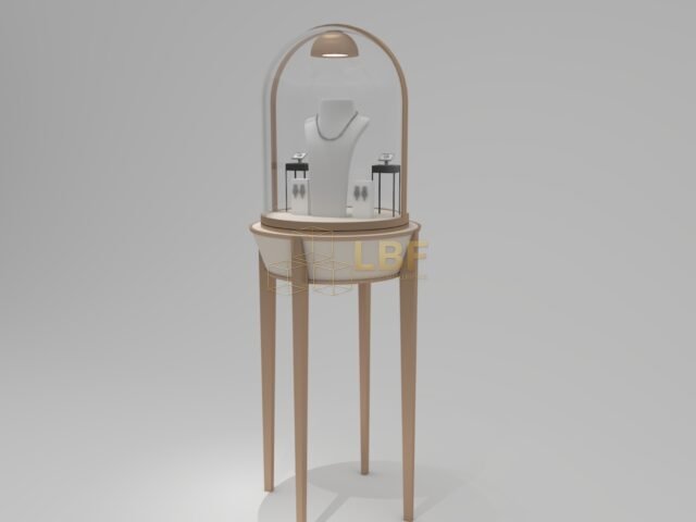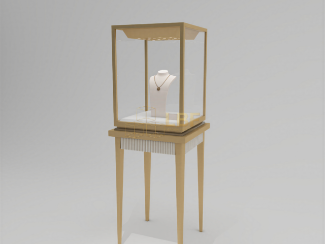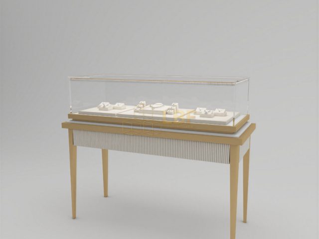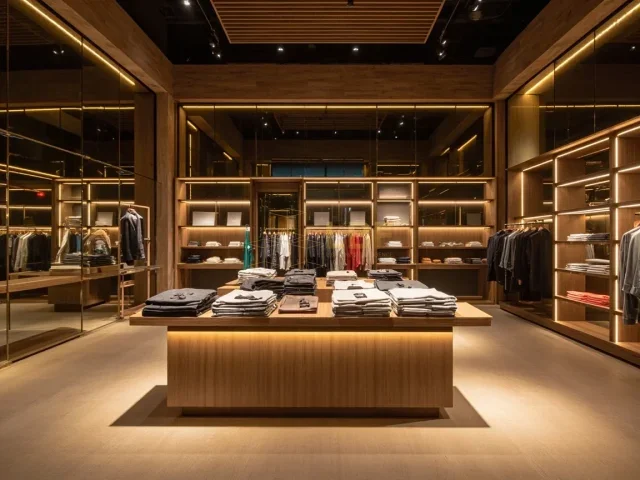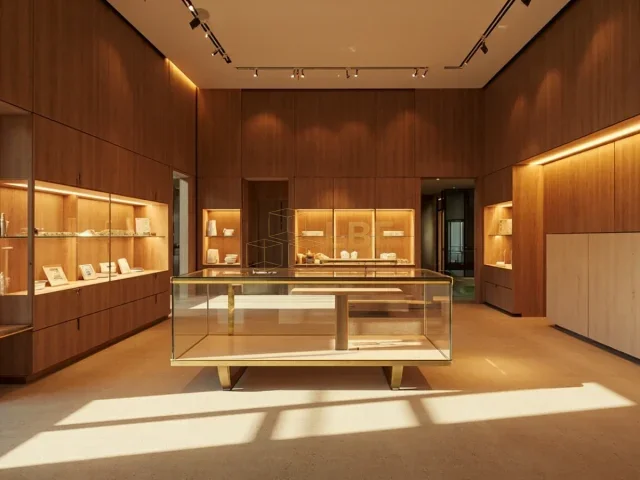
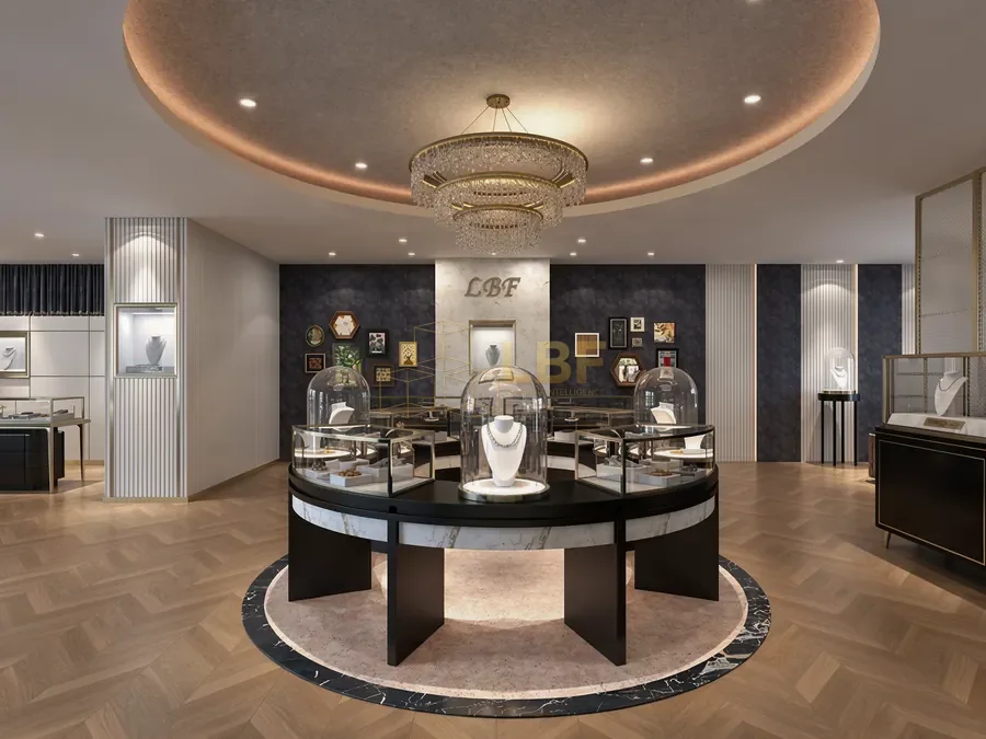
A customer who wants to try on a ring, bracelet or necklace is already close to buying. What happens in the next 90 seconds often decides the sale. Yet many jewelry counters are designed for display rather than for the act of trying pieces on: the mirror is too far away, there is nowhere to rest a handbag, trays crowd the glass, and the client ends up leaning awkwardly over a case. A well-planned jewelry counter try on area solves these problems with a few deliberate choices about mirrors, trays, lighting and personal space. This guide covers the practical specifications we use when building custom showcases for jewelry and watch retailers, with numbers you can apply to your next store fit-out.
Start With the Client’s Footprint, Not the Cabinet
Before choosing finishes, map the movement of a seated or standing client. A comfortable try on zone needs roughly 900–1000 mm of clear depth in front of the counter edge so a customer can sit on a stool, extend an arm, and lean toward a mirror without colliding with the case. Seat height matters too: counter height of 950–1000 mm pairs well with stools of 650–700 mm, while a lower lounge-style setup at 750 mm suits seated consultations with a sales associate beside the client.
Allow at least 1200 mm of circulation behind the client so staff can move between the counter and the safe without asking anyone to shift. If your showroom is tight, a curved or angled counter section dedicated to try on serves better than trying to make every meter of the counter do everything.
Mirror Placement and Size That Actually Works
The mirror is the single most important element of a jewelry counter try on area. A small countertop mirror of 200 × 300 mm is enough for a ring, but it fails for necklaces and earrings. Plan a two-mirror system:
- Countertop mirror, 300–400 mm wide, angled 10–15 degrees back so a seated client sees the hand and wrist without hunching.
- Full-height mirror of at least 450 × 1500 mm, positioned within 1.5 m of the counter and, ideally, at a slight angle so the client can step back while keeping eye contact with the sales associate.
Use first-surface or high-clarity glass to avoid the grey tint that makes diamonds and gold look dull. Edge lighting around the mirror at 3000–3500 K and a CRI of 90 or above keeps skin tones natural and stones accurate; avoid placing the mirror directly under a warm spotlight that creates hot spots on the client’s face. Where privacy matters, a mirror on a side panel rather than opposite a window protects the client from being watched from the street.
Trays, Pads and the Working Surface
A tray that slides or lifts out of the case keeps the selection visible while freeing the glass top for the client’s hands. Standard velvet or suede-lined trays at 300 × 200 mm hold six to eight rings or four bracelets and can be pulled forward without exposing the whole cabinet. Specify removable liners so staff can swap colors seasonally and clean between clients.
A soft mat or leather pad of 400 × 300 mm on the counter gives jewelry a safe landing spot and signals that trying on is expected. Keep the mat in a contrasting tone so small stones and earring backs are easy to spot — a lost earring back on a black surface is a five-minute search, on a mid-grey it is seconds. Build a shallow recessed channel at the back of the counter for a loupe, polishing cloth and a small tray of sanitizing wipes; these small tools make the try on feel professional rather than improvised.
Comfort Details That Reduce Friction
Comfort is not only about seating. Clients hesitate when they have nowhere to put a phone, bag or coat. A small side table or a 250 mm shelf at the end of the counter removes that friction at minimal cost. Stools with a 450 mm seat diameter and a back rest suit longer consultations; backless stools work better where space is tight and clients stand to look in the full-height mirror.
Lighting deserves its own line in the budget. Aim for 500–750 lux on the working surface with a mix of ambient and accent light, and use dimmable circuits so evening consultations can be softer. The goal is to see the jewelry clearly without glare in the mirror — glare is the most common complaint we hear about otherwise well-built counters.
Layouts That Scale From One Counter to a Full Boutique
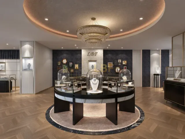
For a single-counter store, a straight run with a mirror at one end and a stool in the middle is efficient and inexpensive. For a boutique with multiple categories, place the try on zone where it can serve rings, watches and necklaces without clients walking the length of the store in each direction. An L-shaped or curved counter with the full-height mirror at the inner corner gives privacy from the entrance and keeps staff sightlines to the door. In museums and exhibition retail, a lower, barrier-free try on point with a 750 mm surface serves visitors of all heights and wheelchair users; include a 800 mm clear knee space beneath.
Plan power and data before the cabinets are built: a duplex outlet for a countertop light or tablet, and cable routing inside the cabinet so nothing is visible from the client side. Libafang builds these details into the joinery drawings so the mirror, trays, lighting and outlets are coordinated rather than added after delivery.
Getting the Details Right the First Time
Most try on areas fail on small numbers: a mirror 100 mm too short, a counter 50 mm too deep, a tray that cannot be reached without standing up. Fixing these after installation usually means rebuilding the cabinet. Fixing them at the design stage costs nothing. If you are planning a new counter or refitting an existing store, send us your floor plan and dimensions and ask for a free design and quote — we will return a layout with mirror positions, tray sizes and lighting notes matched to your space and budget.